A video game interface has an immediate and lasting impact on gameplay, production, and the bottom-line. So… where are all the guides and best-practices for the most important Art in the entire game? Shouldn’t there be a primer somewhere? Some kind of shorthand?
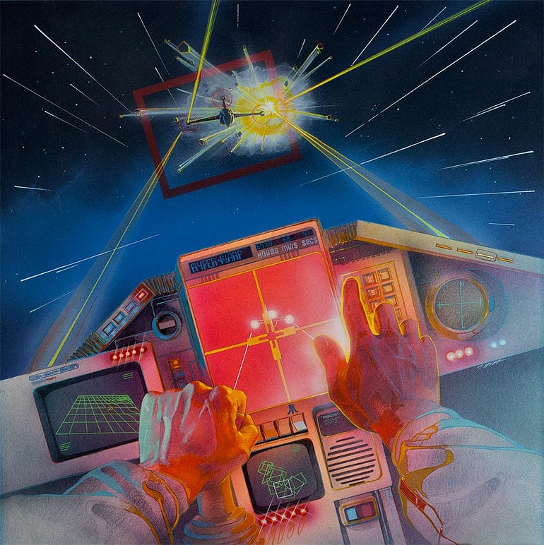
The box art to the Atari cover of Star Raiders
Mistake #1 — You’re putting way too much information on the screen
If you are adding more confusion than clarity, you’re not providing much in the “Heads-Up” department. Let’s try a more tempered approach to throwing in the Kitchen Sink.
Some information can be opt-in; informing the player only as they need to know it. For example: prices inset on buy buttons, click-and-hold commands to read a full note rather than a snippet, complicated weapon stats distilled to a singular DPS value, etc. All information can be “rounded down”.
Some information, once learned, does not have to be relearned immediately. That means some widgets can fade over time, or never show up under certain conditions, for example: hiding combat UI outside of encounters, or giving tutorials a [Do Not Show Me Again] button.